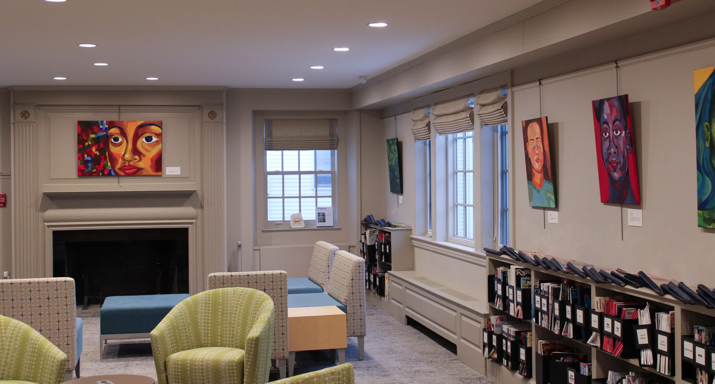
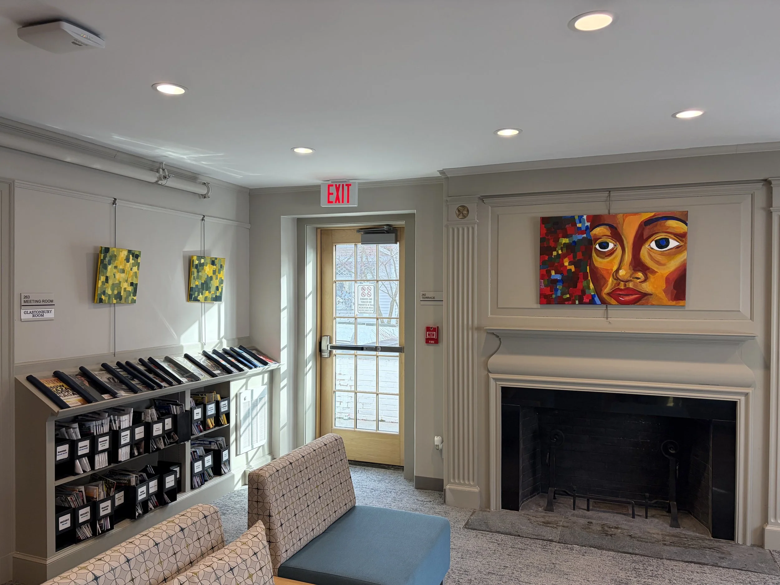
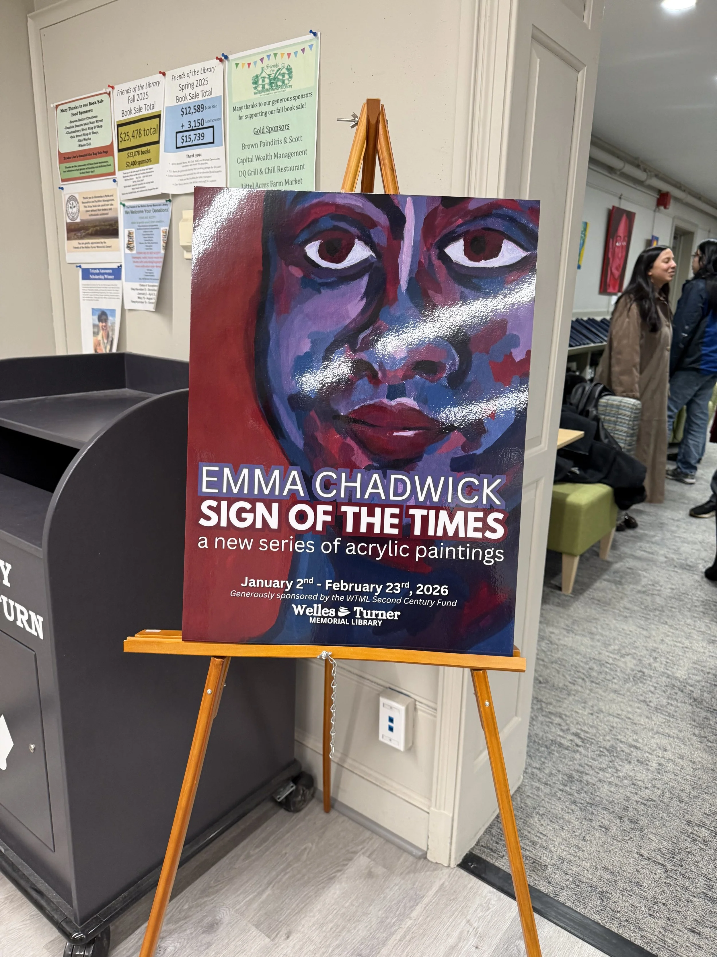
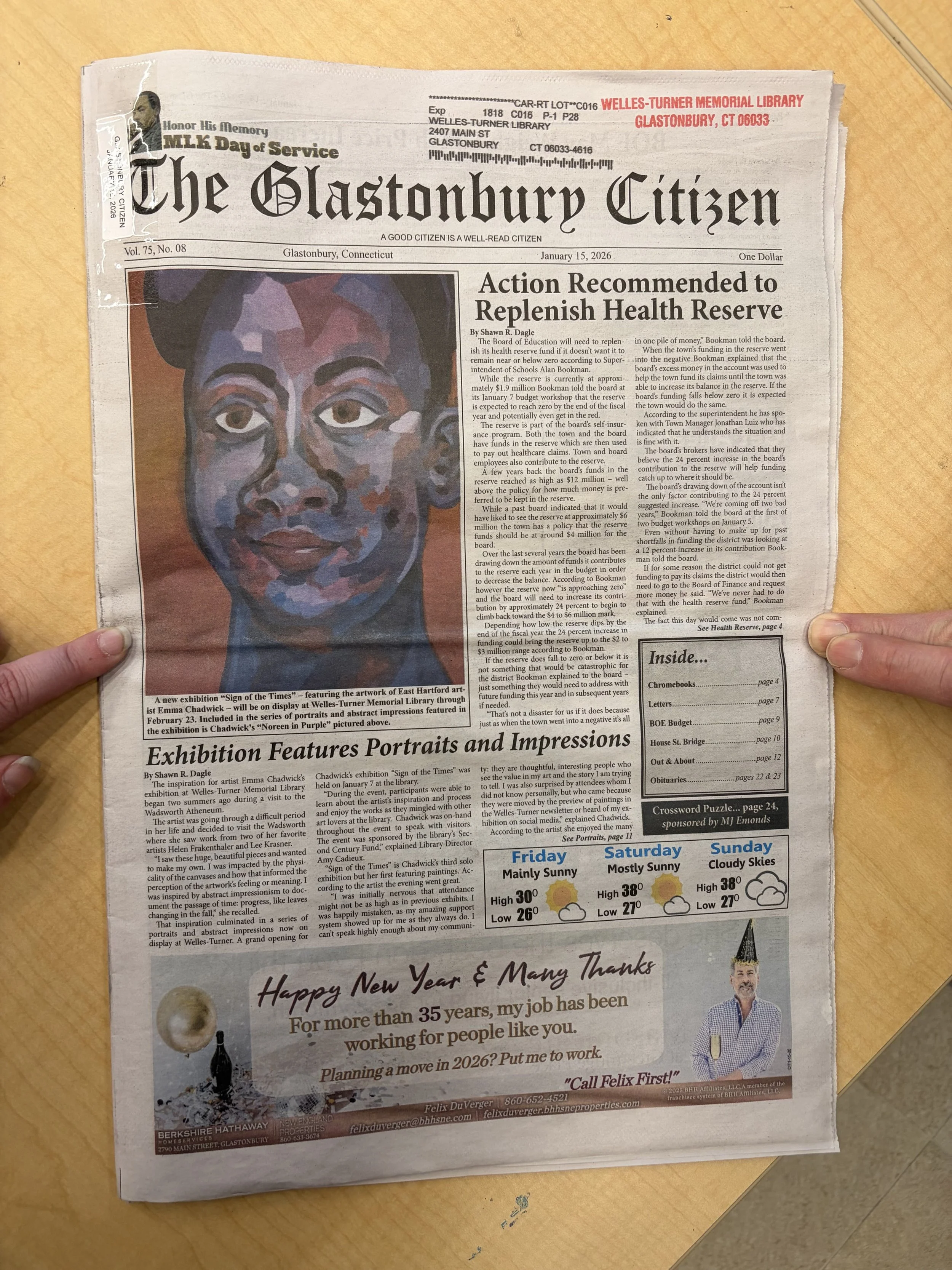
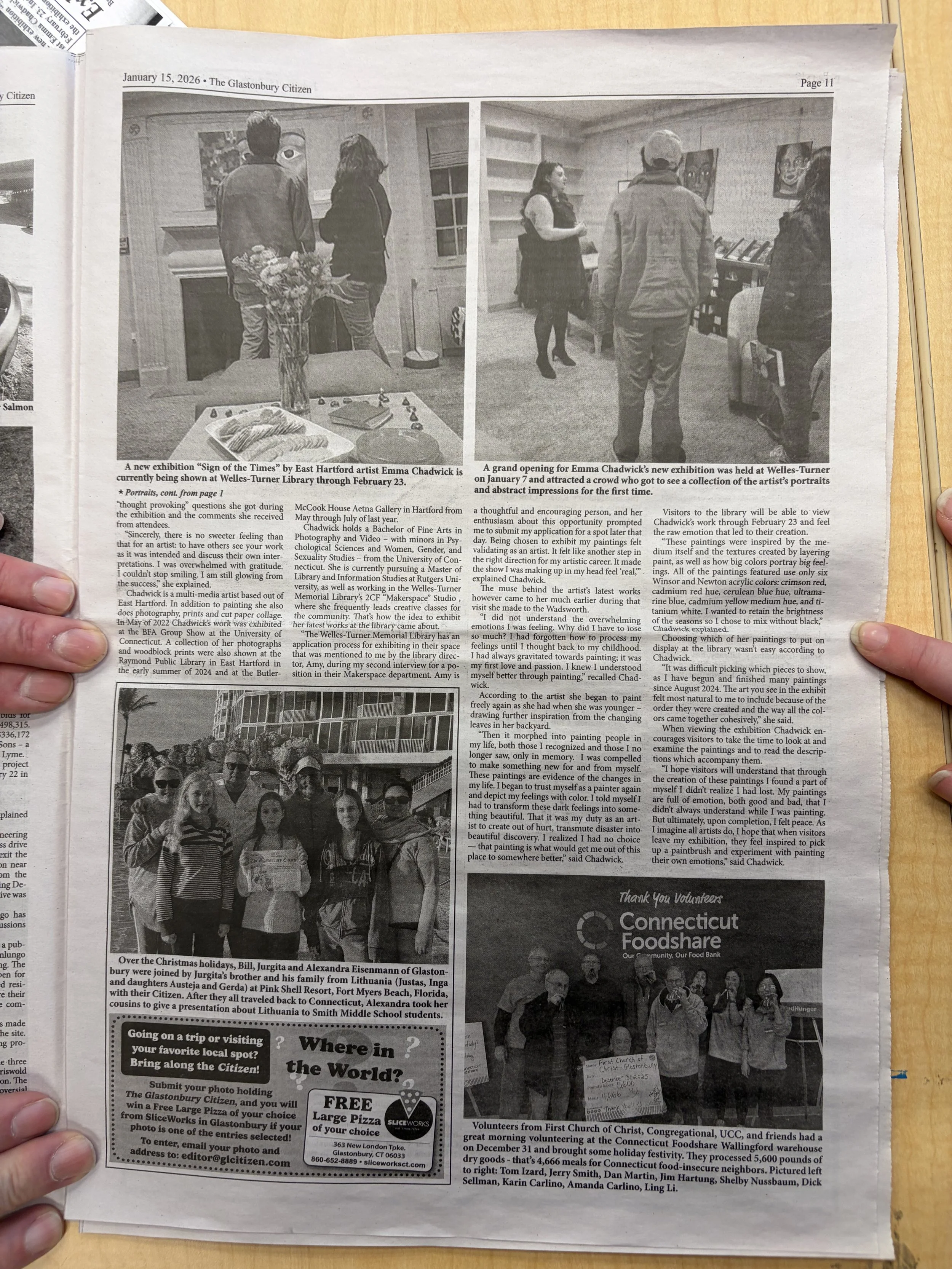
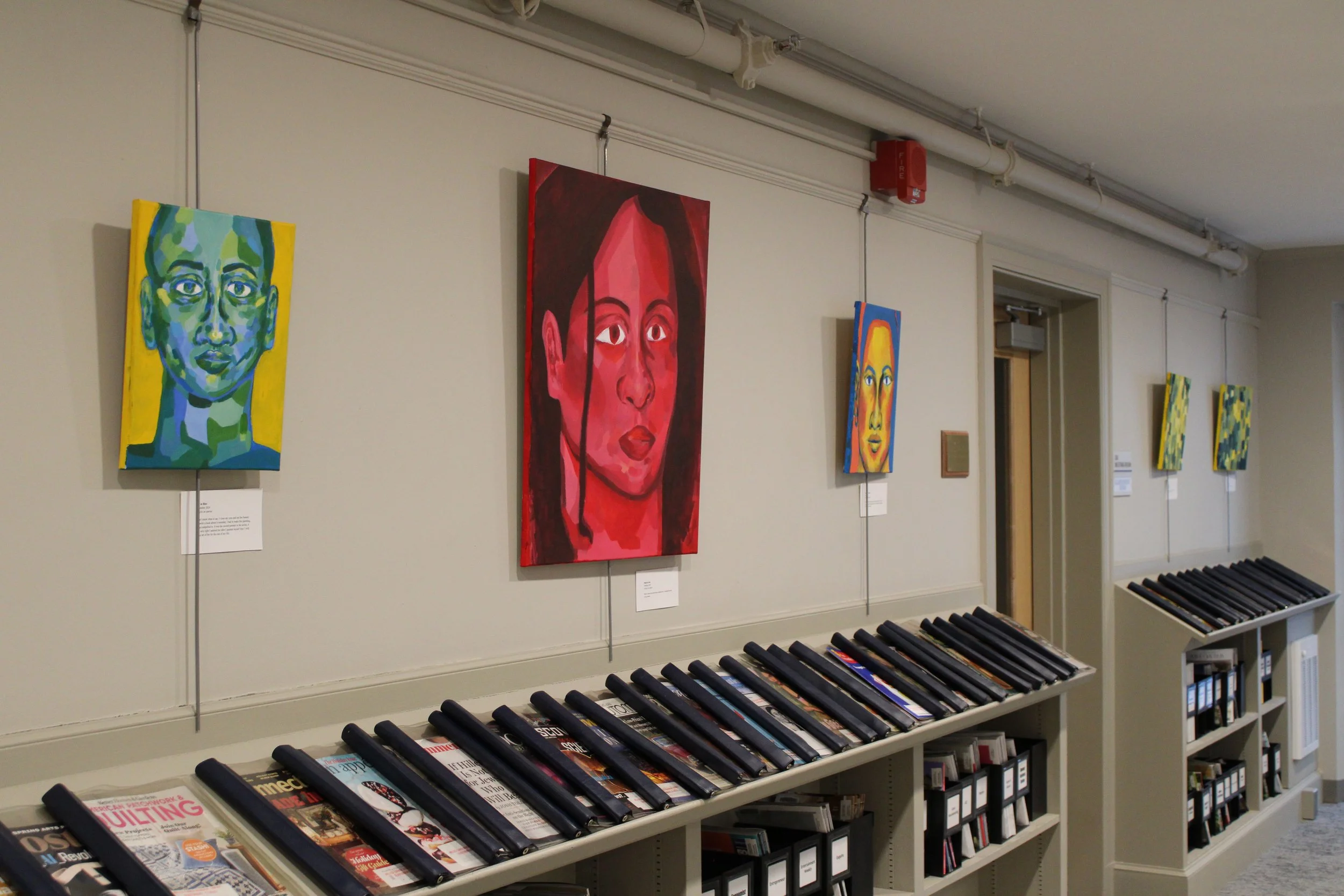
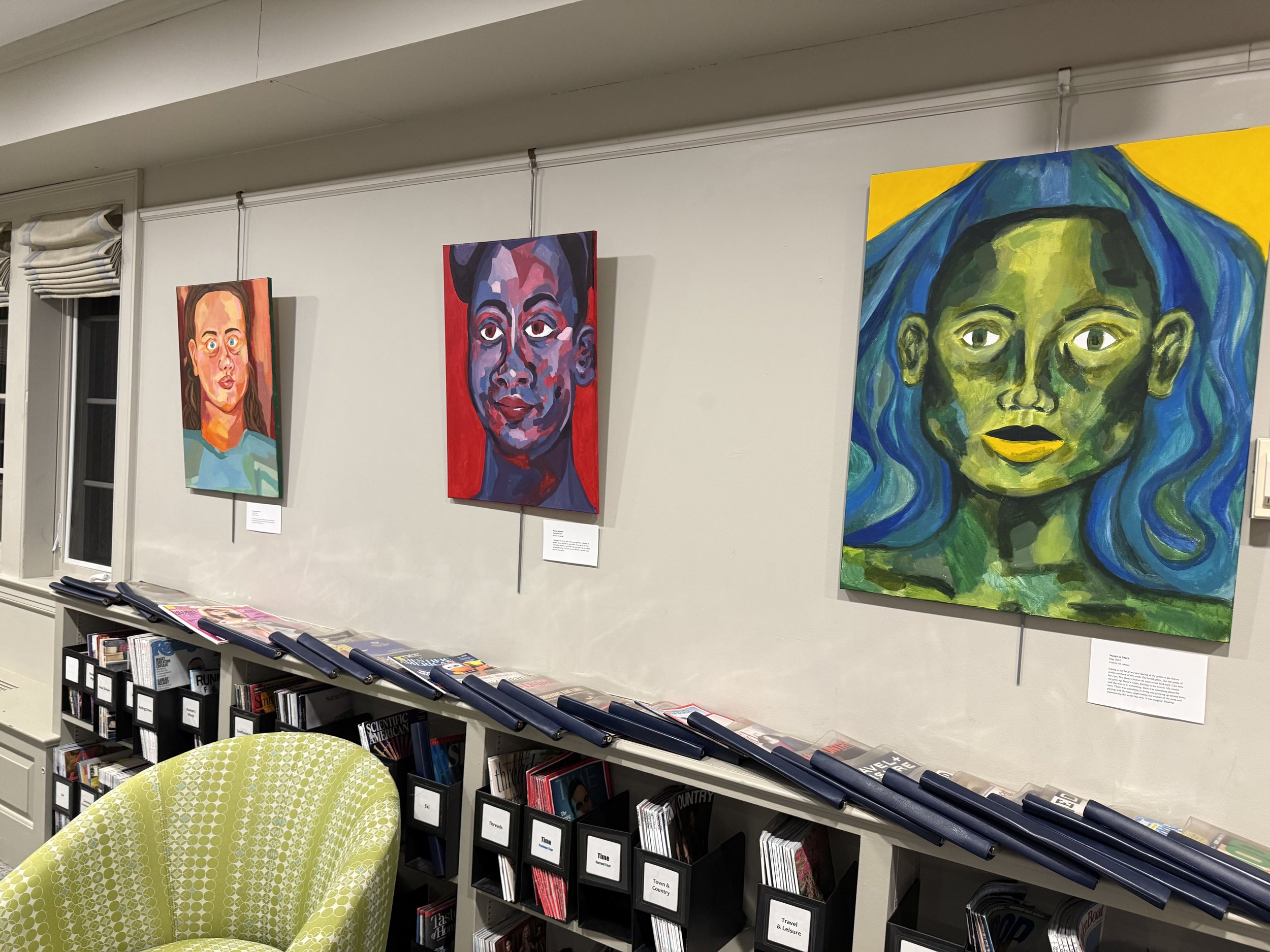
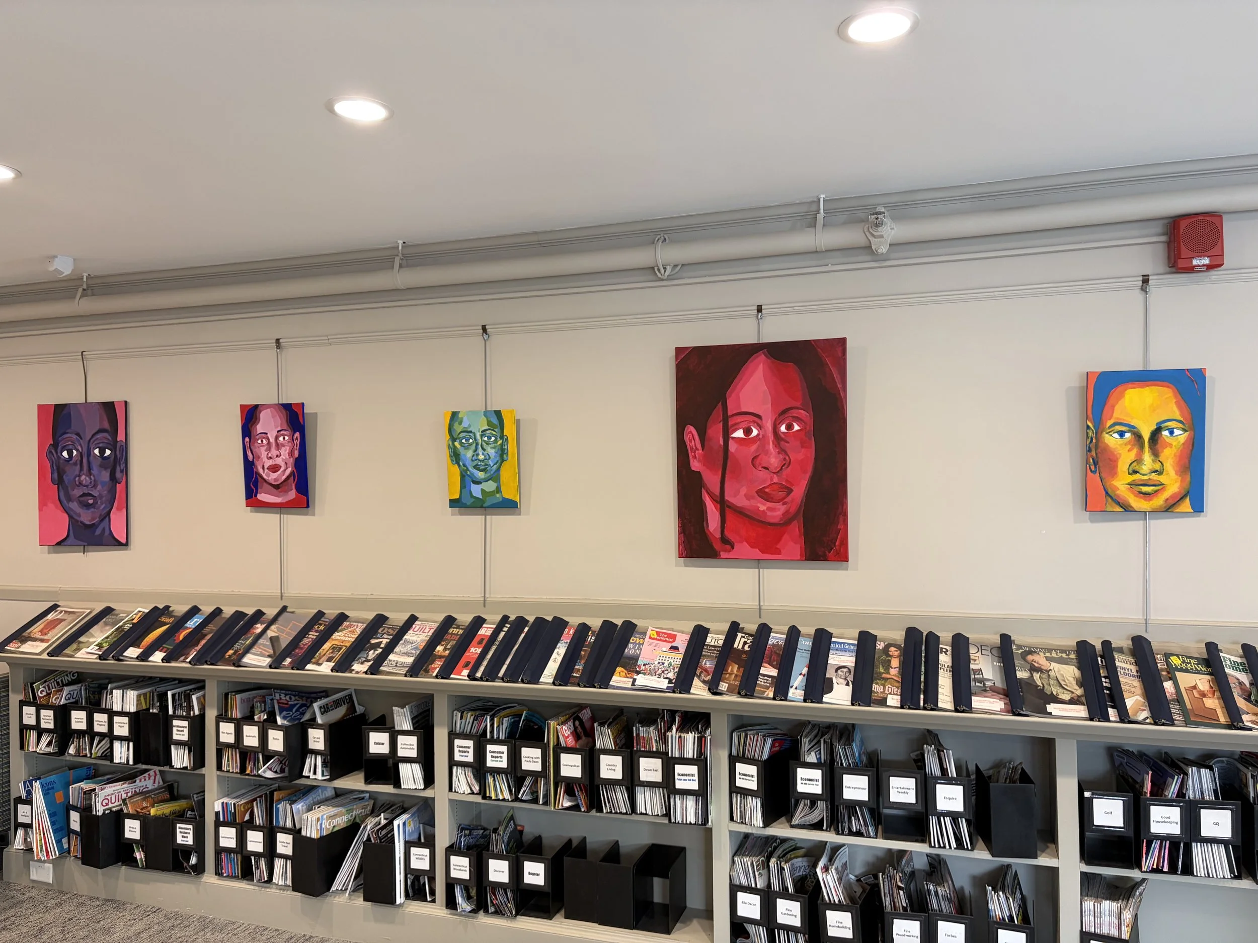
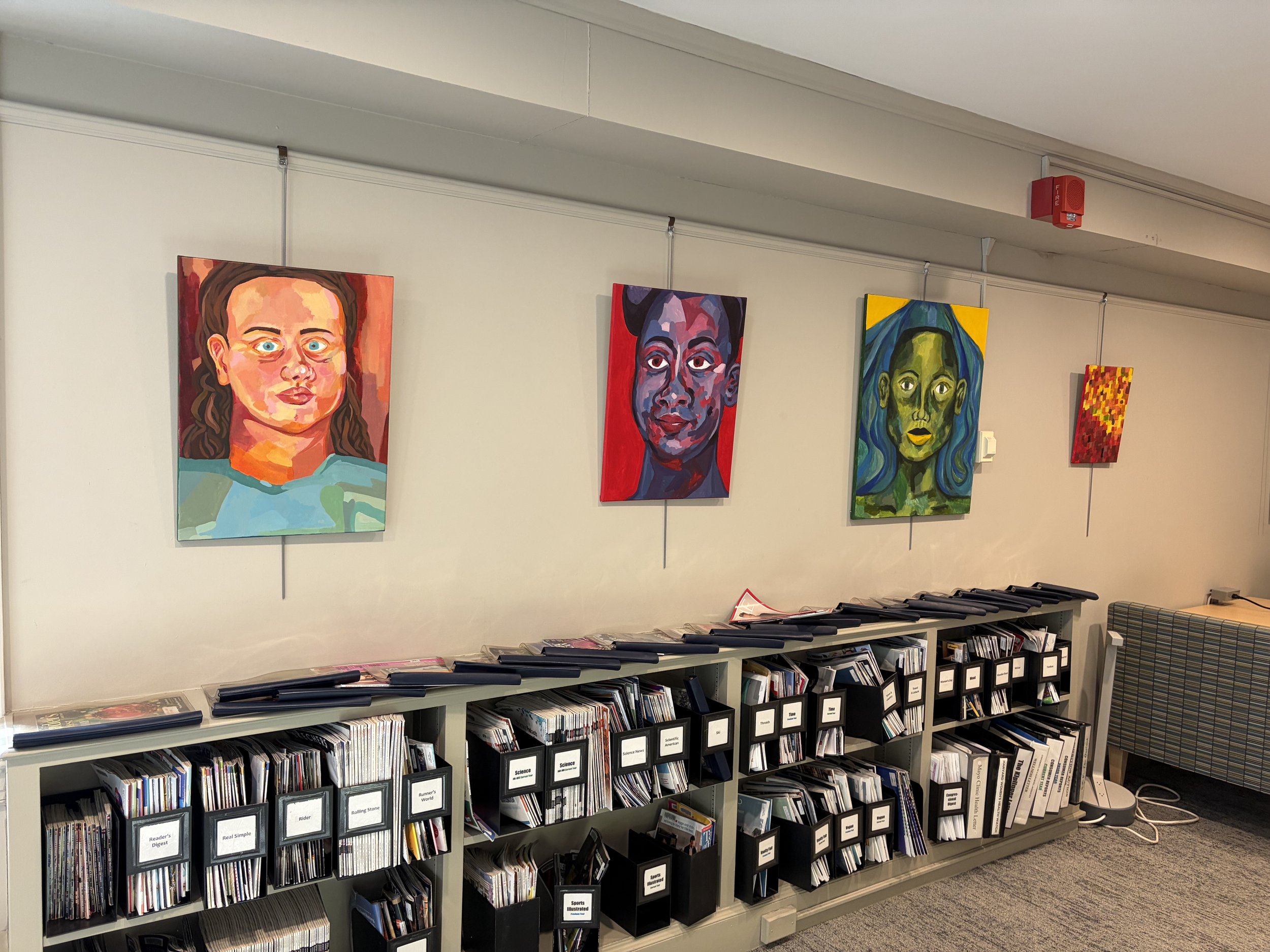
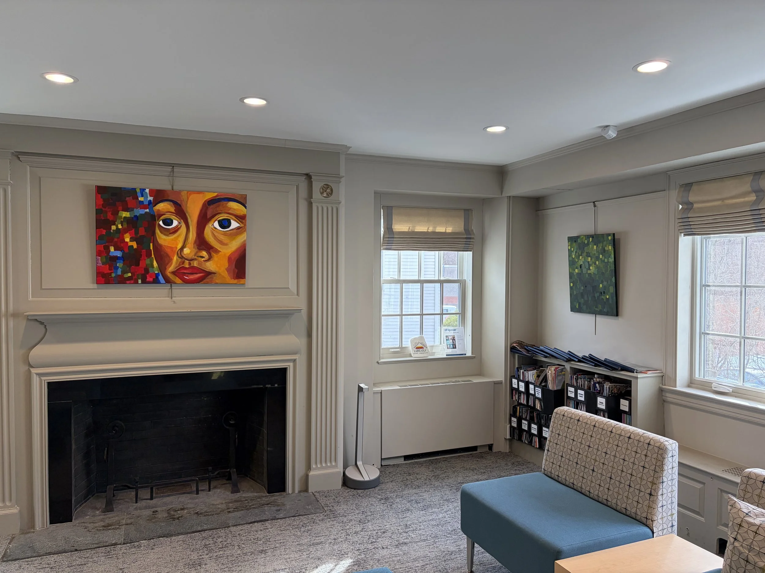
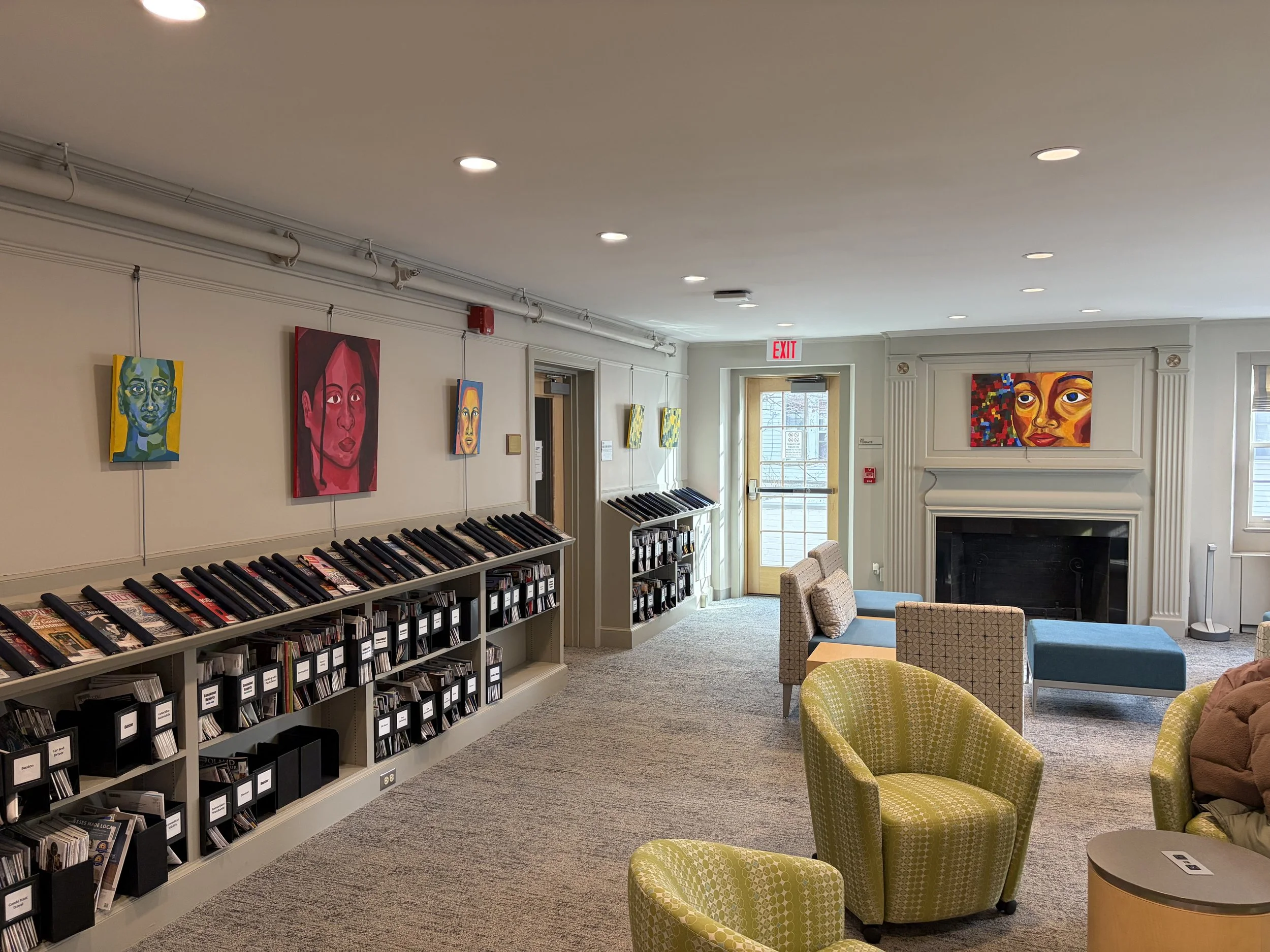
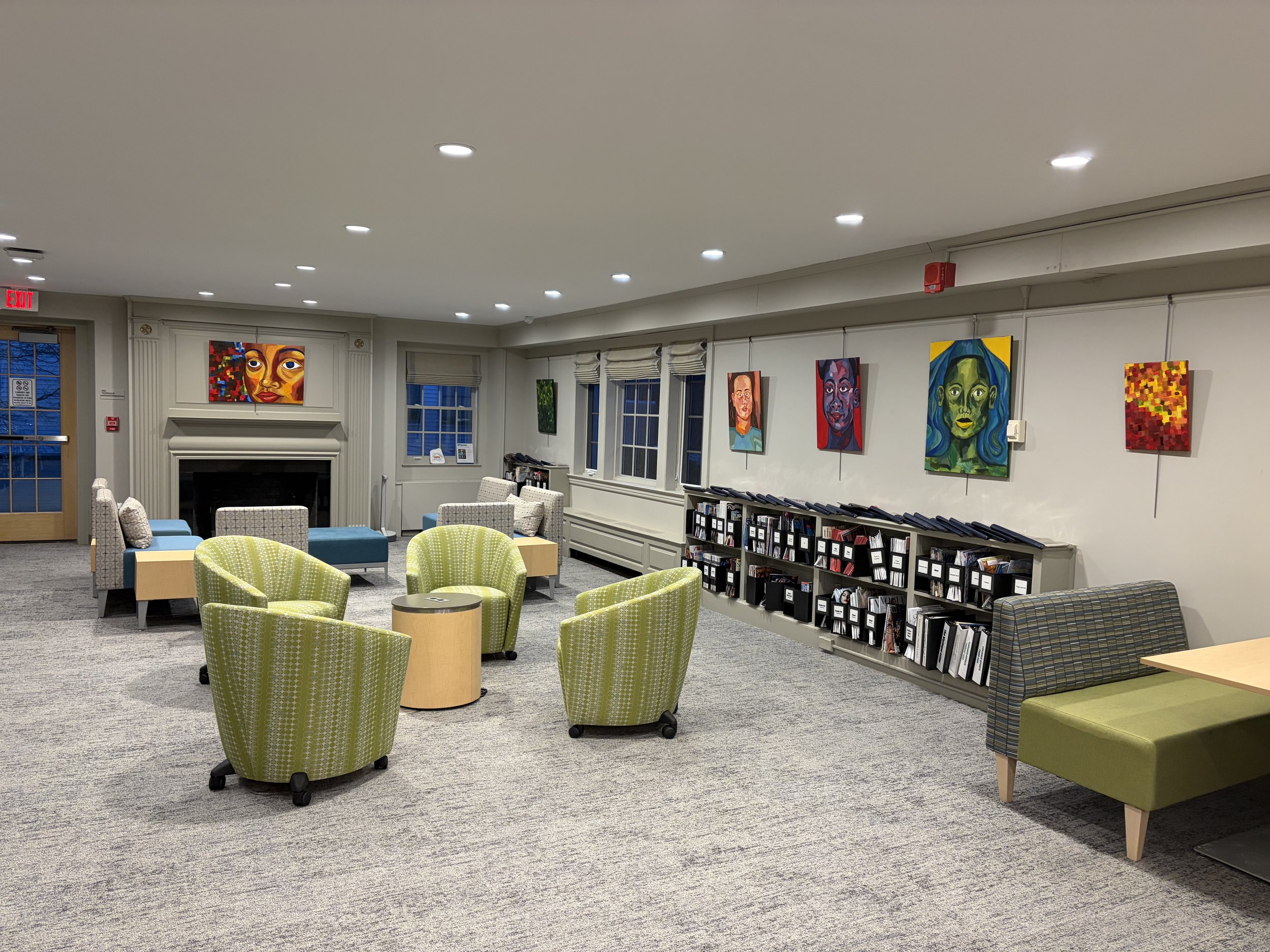
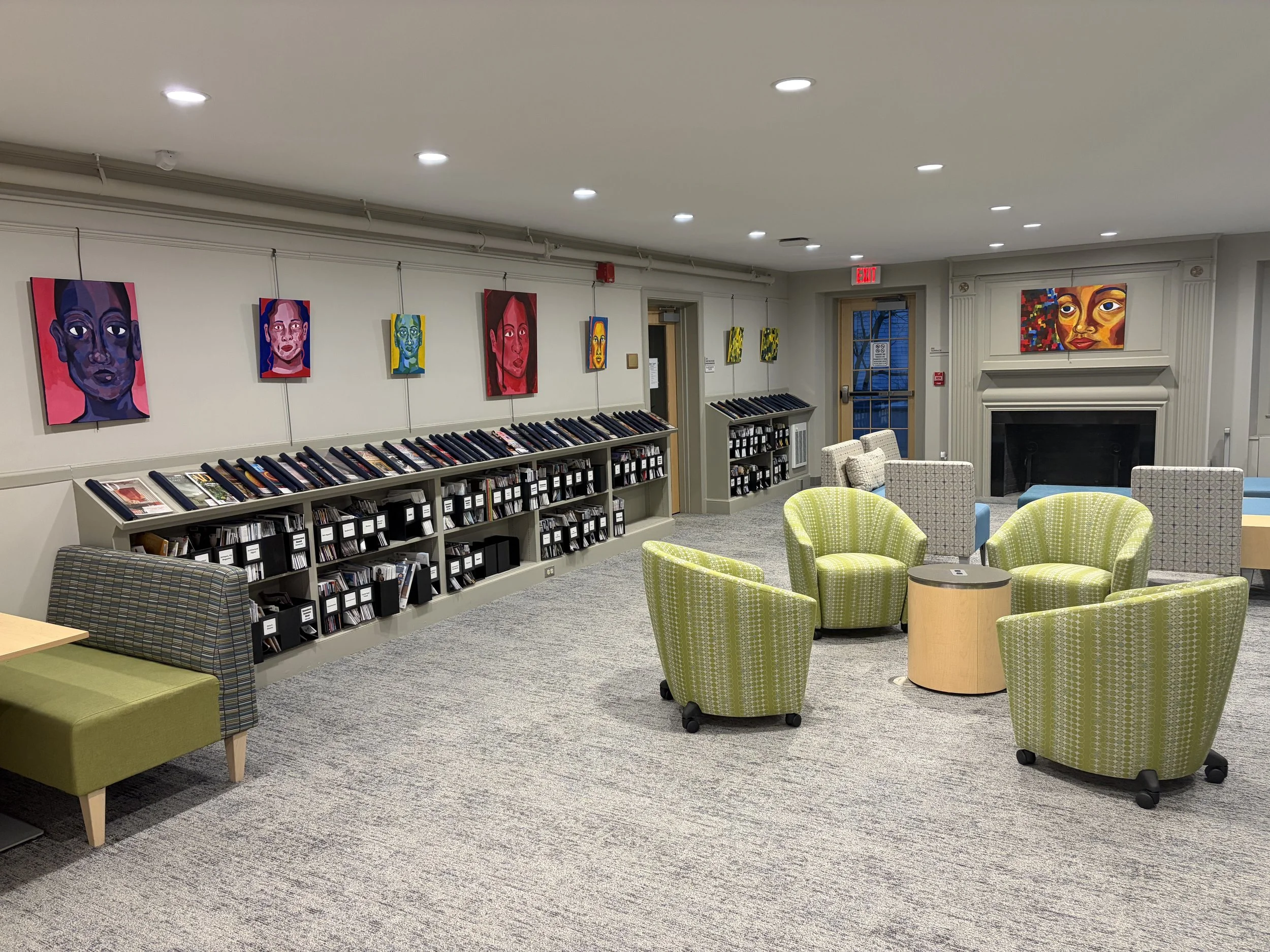
Shown in the gallery space at the Welles Turner Memorial Library in Glastonbury, Connecticut. January to February 2026.
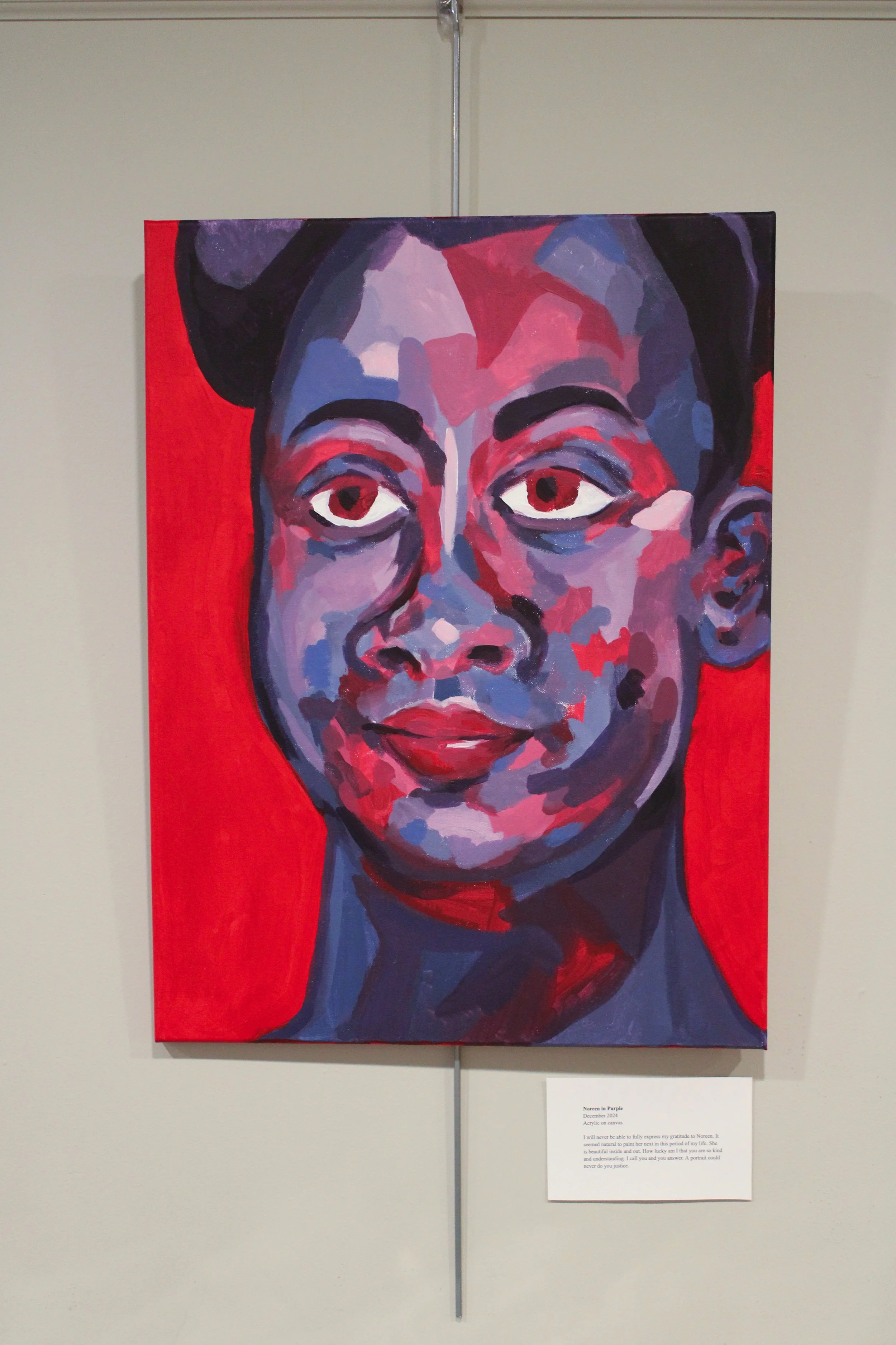
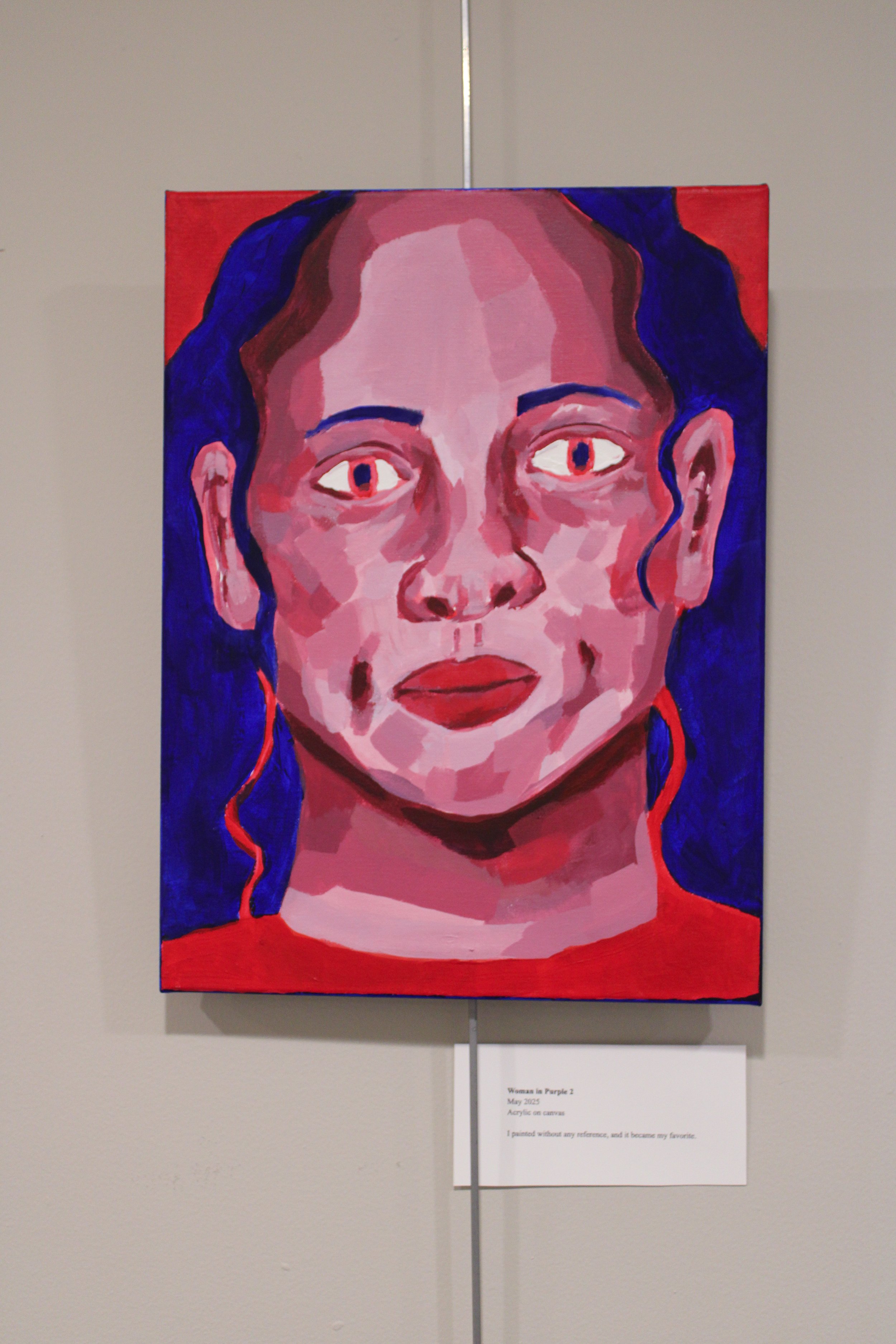
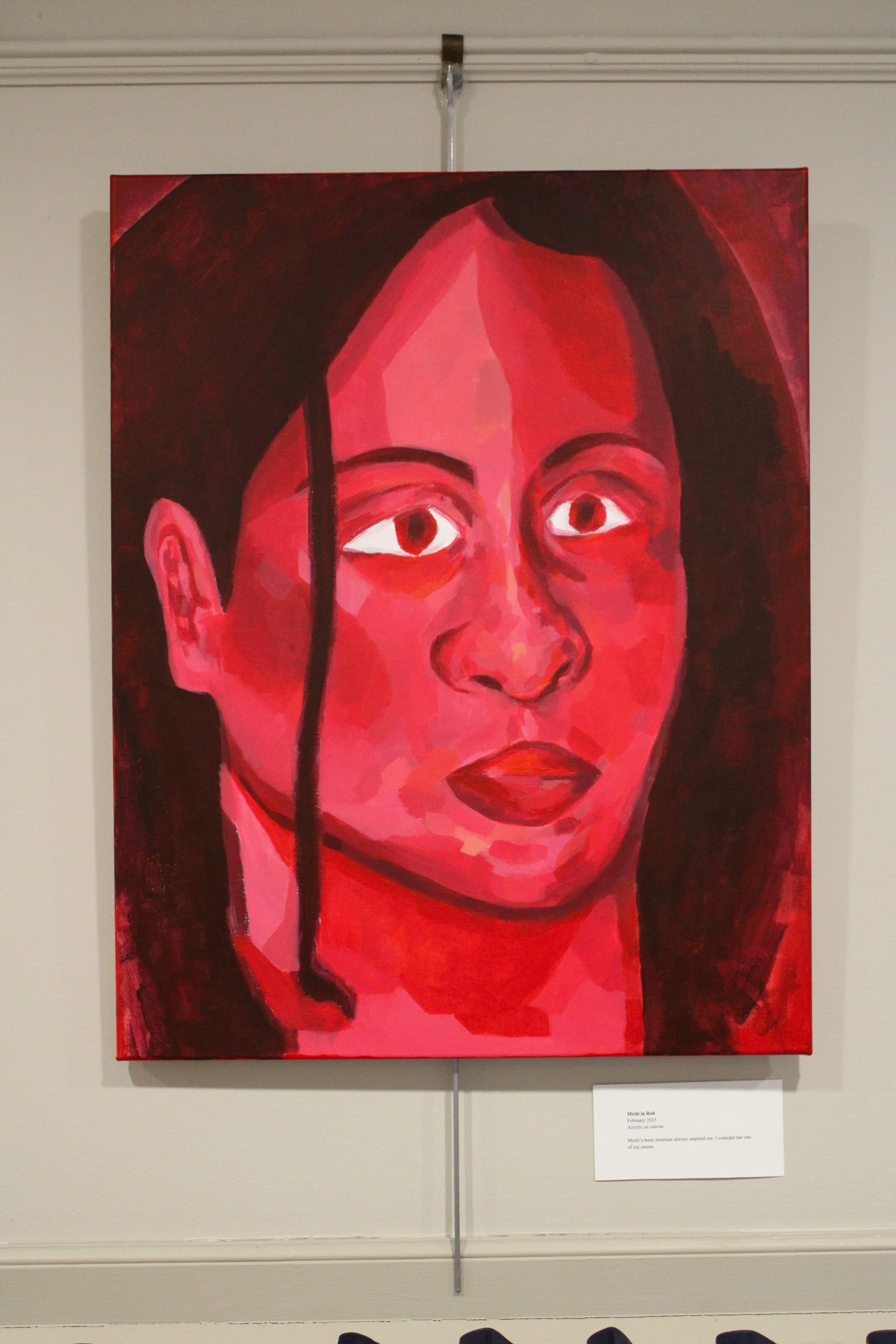
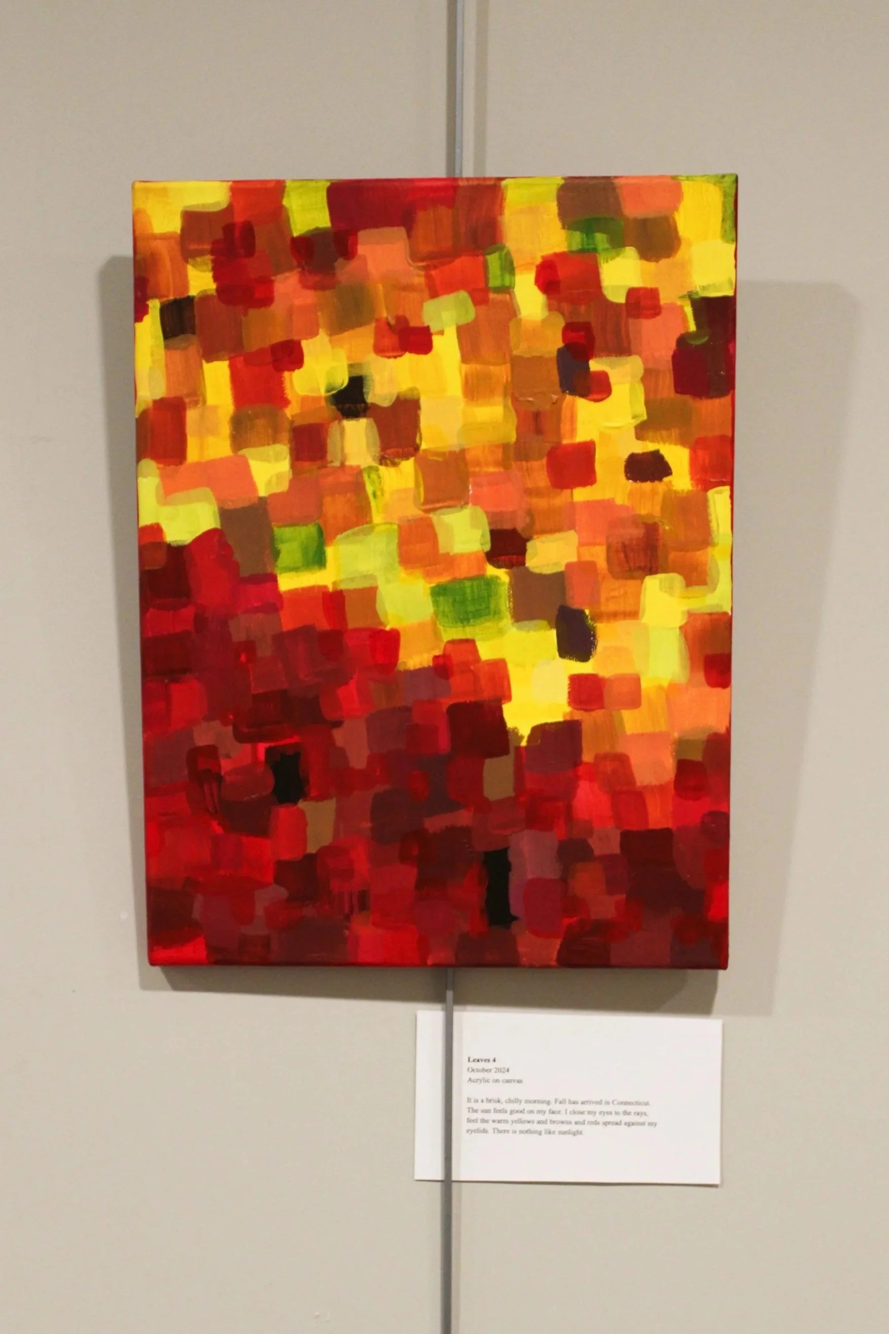
A series of thirteen acrylic paintings hung with title and description placards.
Artist Statement
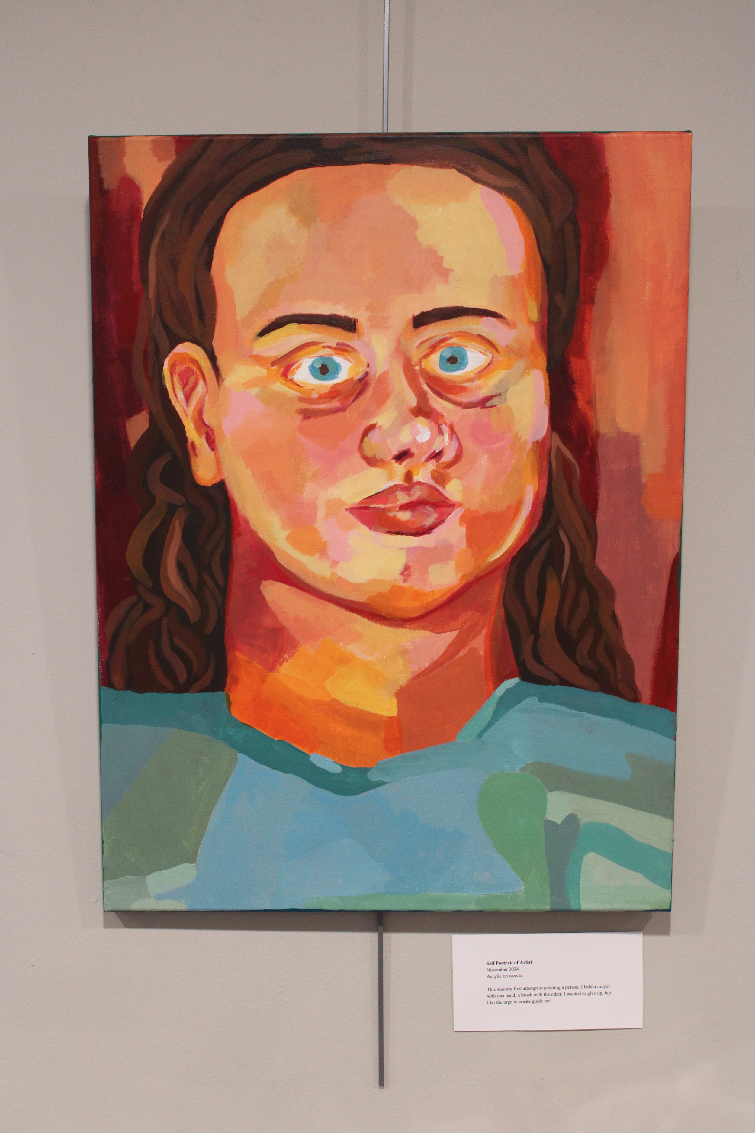
This series began to take shape in August of 2024, during a difficult period in my life. I went to the Wadsworth Atheneum and saw some of my favorite artists' work: Helen Frankenthaler and Lee Krasner. I saw these huge, beautiful pieces and wanted to make my own. I was impacted by the physicality of the canvases and how that informed the perception of the artwork’s feeling or meaning. I was inspired by abstract impressionism to document the passage of time: progress, like leaves changing in the fall. I did not understand the overwhelming emotions I was feeling. Why did I have to lose so much? I had forgotten how to process my feelings until I thought back to my childhood. I had always gravitated towards painting; it was my first love and passion. I knew I understood myself better through painting. To honor who I was and who I am, I began to paint freely, inspired by the changing leaves in my backyard. Then it morphed into painting people in my life, both those I recognized and those I no longer saw, only in memory. I was compelled to make something new for and from myself. These paintings are evidence of the changes in my life. I began to trust myself as a painter again and depict my feelings with color. I told myself I had to transform these dark feelings into something beautiful. That it was my duty as an artist to create out of hurt, transmute disaster into beautiful discovery. I realized I had no choice — that painting is what would get me out of this place to somewhere better.
These are a sign of the times.
These paintings were inspired by the medium itself and the textures created by layering paint, as well as how big colors portray big feelings. All of the paintings featured use only six Winsor and Newton acrylic colors: crimson red, cadmium red hue, cerulean blue hue, ultramarine blue, cadmium yellow medium hue, and titanium white. I wanted to retain the brightness of the seasons so I chose to mix without black. In their title cards it includes the painting’s title, date started, materials and a short description of the piece.